
Updated: May, 2 2024
15 Different Color Schemes to Try in Your Designs
Any website, invitation, event poster and more can be transformed with the right color scheme. Where will the power of color take your project?


A painting made of cool blues, sea greens, and a dash of purple could transport you right to the shores of your favorite beach. A battle of the bands poster with bursts of saturated pinks, bright reds and deep blacks could help potential attendees expect a fun, upbeat and lively night. No matter how you choose to use color in your designs, the right color combination is crucial in creating striking visual graphics.
Color Schemes Explained
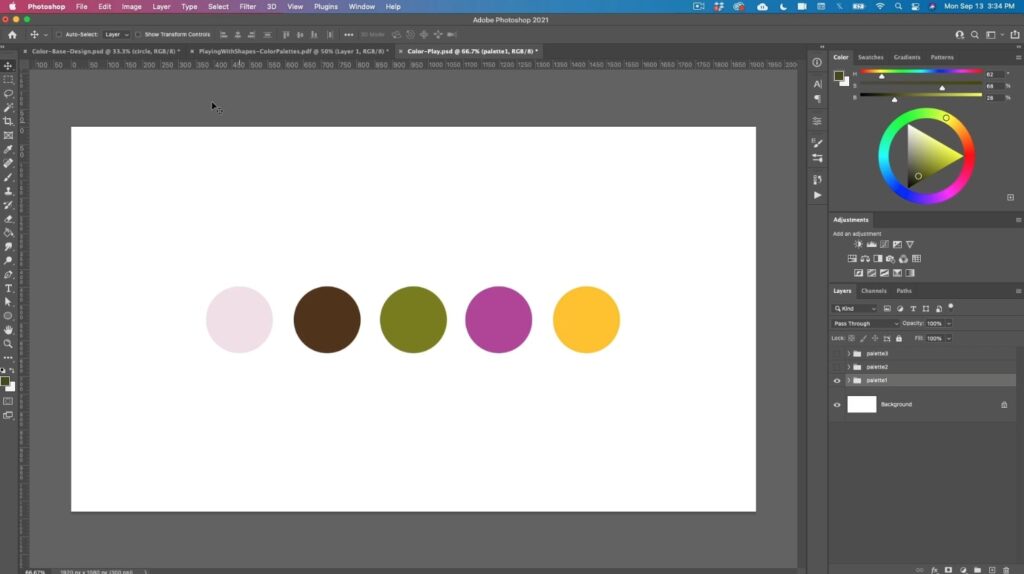
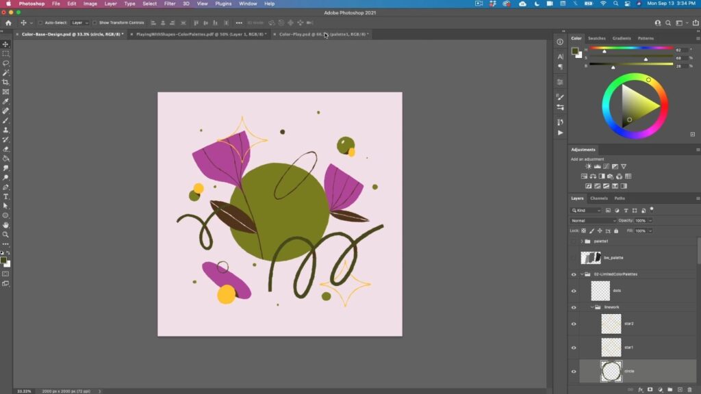
Scroll down to see how this designer transformed this color palette into a full-blown design.
A color scheme is a specific combination of colors, usually based on a particular aesthetic, mood, theme, or color. Understanding color schemes can help you make more impactful and intentional color choices in your work.
If you’re designing a website for a meditation center, you can streamline your workflow by choosing the brand’s calming and soothing color scheme beforehand. You might handpick a few blues, greens and whites that complement each other and convey a sense of tranquility. Then, when you’re choosing colors for the fonts, page backgrounds or other design elements, you’ll already have a group of colors that work well together and work well with the overall brand.
Types of Different Color Schemes
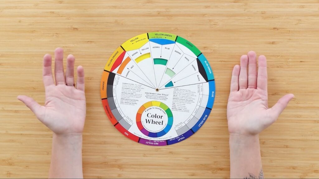
Color wheel tools like this one can be really helpful when you’re still getting the hang of color theory.
Color theory is the study of how different colors work together and the feelings they portray. If you’ve used a color wheel you already have a general understanding of color theory because the wheel is set up in a way that helps people easily understand the way colors relate to each other. Using the color wheel, you can create seven different color schemes.
- A Monochromatic color scheme uses different variations of one color like light blue, baby blue and electric blue.
- A Complementary color scheme uses colors that are opposite on the color wheel like purple and yellow.
- A Split Complementary color scheme uses one base color and two accompanying complementary colors like yellow, purple and blue.
- An Achromatic color scheme only uses colors without hue including black, white and gray.
- An Analogous color scheme uses colors that are next to each other on the color wheel like orange, yellow and green.
- A Triadic color scheme uses colors that are spaced out evenly on the color wheel like red, yellow and blue.
- A Tetradic color scheme uses two complementary color sets that form a rectangle on the color wheel like purple, yellow, orange and blue.
Best Tips to Use Color Schemes
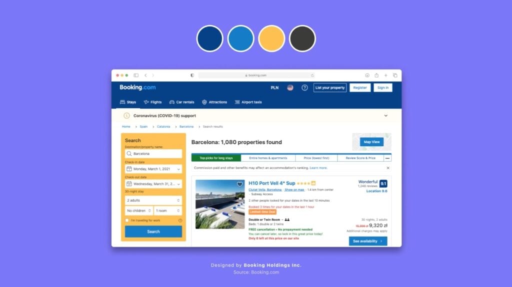
Using real-life inspiration is a great way to find your own project’s color scheme.
Choosing the best color scheme for you is going to depend on your project. You’ll likely use a completely different color scheme for an advertisement for a new Italian restaurant than you would for a five-year-old birthday party invitation. Here are a few tips for using color schemes:
- Pay attention to color theory and what emotions and feelings your color scheme gives off.
- Look on Pinterest or Google Images to see what color schemes other designers used for a similar project.
- Make sure your colors have a defining link. Whether it be their position on the color wheel, a common theme or a similar mood, your color scheme should have something that ties them all together.
- Use existing images or art for inspiration. Websites like Coolors can extract color palettes from any image.
- Try a color palette generator if you’re looking for some premade color schemes.
- Keep your color scheme simple. Too many colors can overcomplicate your design and make it harder to discern a certain feeling, mood or theme.
- Achieve balance and harmony by considering the value and saturation of your colors.
- Make a few mockups of your design using different color schemes. Sometimes you have to see the color schemes in action to design which is best for your project.
Stunning Examples of Color Schemes
What sort of feeling or emotion do you get from this color scheme?
You can create different color schemes based on a few different elements and ideas. For example, you could base a color scheme off of a season like spring and fill your design with pastel purples, light pinks and mint green. Here are a few color schemes you can explore in your work: Draft a paragraph introducing this section.
- Midnight Metropolis: Include saturated yellows, light grays, black and neon blue to mimic the colors of an evening in a big city.
- Tranquil Tides: Use seaglass green, cool blues and sandy whites to call on the feeling of being by the ocean.
- Woodland Winter: Combine bright whites, olive greens, earthy browns and sky blue to evoke images of a hike through a snow-covered forest.
- Citrus Sanctuary: Use lemon yellow, lime green and bright pinks and oranges to bring forth feelings of a sunny day in a citrus grove.
- French Country: Unite forest greens, warm browns, rusty reds and deep oranges to call up images of a weekend in the countryside of France.
- Earthy Cafe: Include espresso brown, caramel, leafy greens and a sandy white to call on the feeling of being inside a warm coffee shop.
- Teenage Bedroom: Use hot pinks, lavender, electric blues and bright yellows to mimic the feeling of colorful and creative teenage decor.
- Dreamy Doze: Combine soft grays, light blues and creams to bring forth feelings of a cozy night’s sleep.
Discover Your Ideal Color Scheme
No matter if you’re off to design a hot dog brand’s new website or an invitation to your wedding, using these color scheme tips can help you create a final product that feels polished and put together. If you still want a little more guidance when it comes to creating and using color schemes, Skillshare has the best class selection for learning color theory, from beginners to advanced.
Try Skillshare for free! Sign up for a 7 day free trial today!
Get Started- Unlimited access to every class
- Supportive online creative community
- Learn offline with Skillshare's app
Join Skillshare
Join today for unlimited access to thousands of classes and more.
Try Skillshare For Free


