CYMK, RGB, or Pantone? How to Pick The Best Color System for Print
Ready to print your artwork? Follow this surface designer’s top tips on choosing the right color system for your needs!
No matter where you’re sitting right now, you can probably pick out at least a dozen colors around you. You might notice your pale yellow couch, your blue denim jeans or the red cursive on the wedding invitation stuck to your fridge. All of these colors are part of color systems, which are sets of colors that represent a specific color spectrum and model.
Understanding how to use color systems is a valuable skill when working in surface design and print production because certain color systems are better equipped to tackle certain printing jobs. CMYK, RGB and Pantone are all color systems but the colors within them and how to use them are vastly different.
Surface pattern designer Kris Ruff knows the importance of preparing her artwork for print—whether that be her seamless pattern designs or her standalone illustrations. With her expertise and Skillshare class as your guide, you’ll discover the benefits of and differences between CMYK, RGB and Pantone when it comes to printing.
CMYK: The Standard for Print

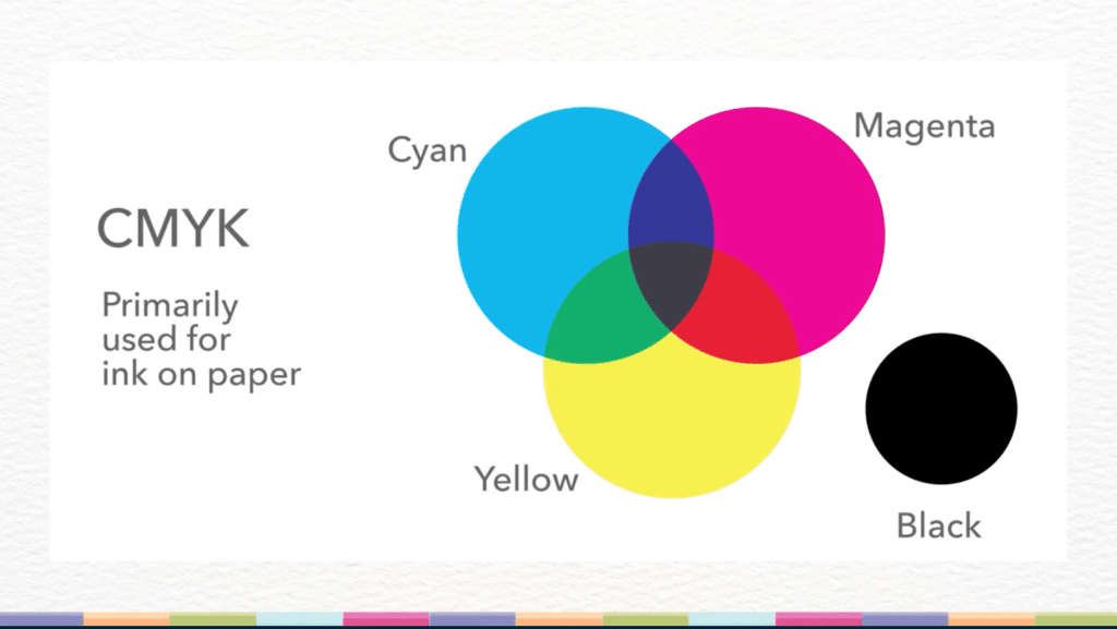
CMYK, sometimes referred to as process colors, stands for Cyan, Magenta, Yellow and Black. Black is represented by the letter “K,” which refers to “key” or “key plate.” In old-school printing, the key plate often used black ink because it was the printing plate that added detail to an image.
Some people also believe that “K” was chosen to represent black to avoid confusion about whether “B” stood for blue or black, as the original tricolor printing process used red, yellow and blue.
Designers, artists and illustrators use CMYK in offset printing and digital printing. When it comes to printed applications like postcards, brochures, art prints, fliers, posters, banners and signage, CMYK is the best choice because printers work in CMYK.
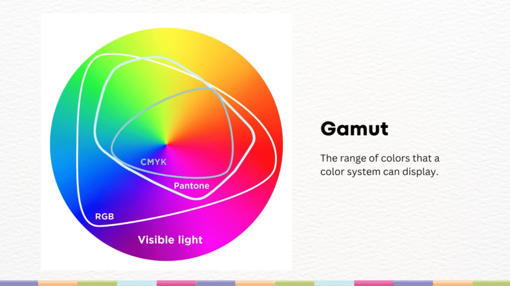
Kris emphasizes that CMYK has a smaller gamut of colors compared to RGB, the color system that creates color on your screen. If you’ve ever tried to print a photo with bright colors or a digital illustration with neon details, you might have noticed that the printed version doesn’t seem as vivid.
Since CMYK has a smaller amount of possible colors, your printer can’t make colors like neons and bright blues, which leads some RGB images to look dull when printed.
Pantone: The Universal Color Language

Pantone is a standardized color system used worldwide. Invented in 1963, Pantone was created so that designers, artists and creators could select a color and be sure it could be reproduced accurately by anyone in the world. The Pantone color system is used in industries like textiles, interior, architectural and industrial design, apparel and beauty and it defines the colors in pigments, printing, fabrics, coatings, plastics and more.
Pantone guarantees color consistency across different materials, factories and industries so that you can create a lamp, water bottle and cotton comforter in the same baby blue color.
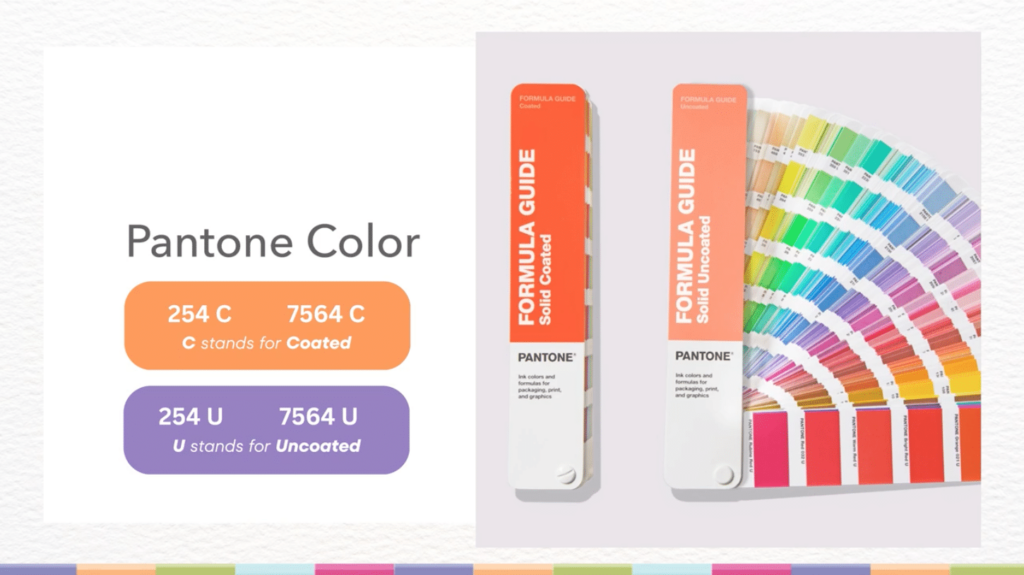
In her Skillshare class, Kris mentions the importance of differentiating between the two Pantone categories: the original Pantone Formula Guide and the Pantone Fashion Home and Interiors (FHI).
The Pantone Formula Guide is made for print and has two versions: the coated version, represented by the letter C, and the uncoated version, represented by the letter U. These two versions show what the colors will look like on shiny versus dull paper, respectively.
The Pantone Fashion Home and Interiors has two coding systems TPX and TPG. The TPG system is the newer version of the TPX system but some designers still use the TPX system. The letter X is replaced by G, which stands for “green,” and represents Pantone’s new sustainable initiatives.
Pantone is ideal for branding and large-scale production because you can ensure that all of your products, no matter the run or the material, are the same color. Some Pantone colors are even trademarked by brands. Mattel Barbie Pink, Tiffany Blue and UPS Brown are all trademarked Pantone colors.
Pantone’s color precision does have a cost. You have to purchase one of their guides for any color matching. Sometimes, smaller print batches can be more expensive to print in Pantone than in CMYK.
RGB: The Digital Color System
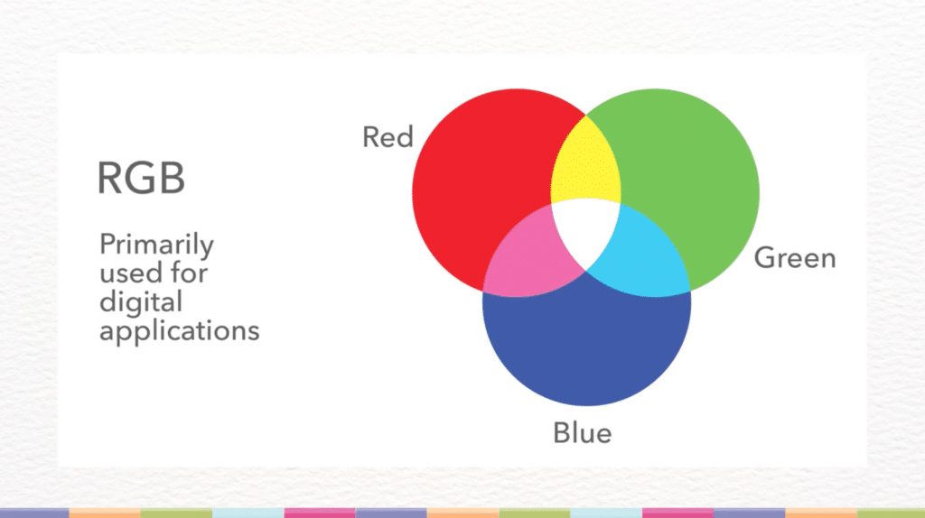
RGB stands for red, green and blue and is the color system for digital applications. Also known as additive primary colors, red, green and blue work together in different ways than the subtractive primary colors, cyan, magenta and yellow.
Since RGB is the color system for light rather than pigments, it is used for screens, digital art, TV displays and other tech applications. If you zoom in close enough to any of your screens, you’ll see red, blue and green pixels as the building blocks for all of your colors. RGB will be the basis for color in Procreate and other digital art apps.
RGB has a much wider color gamut than Pantone or CMYK, which means some of its brightest colors cannot be reproduced in print. Its large range of colors is why a lot of colors in RGB appear brighter and more vivid than CMYK. If you convert any RGB-based creations to CMYK, you might find yourself with a duller final product.
Digital designers should have a strong understanding of RGB so that they can properly use color in UI/UX design, websites and within software like Adobe Illustrator.
Get Creative With Your Color Choices
More Art and Illustration ClassesColor Alchemy: A Fun Hands-on Approach to Color Theory for Surface Designers and Digital Artists
Color Theory for Character Designers: Tips and Tricks
The One-Palette Illustrator: Discover How Color Works in Your Art
Color Theory for Illustrators: A Fun Beginner’s Guide to Creative Color
Why CMYK is the Best Choice for Print

As a surface pattern designer, Kris Ruff takes many of her creations off her computer screen and into the real world, whether that be as a t-shirt design or an illustration on the front of a greeting card. She often works in CMYK because it matches real-world print capabilities, which means that the colors on her screen will match those printed onto her newest tote bag or postcard.
As a color system, CMYK has the smallest range of colors, which you can see in the color wheel above. With fewer color options, you might be enticed to work in RGB so you can achieve those bright yellows and neon greens. But if you’re planning on printing your digital art, you’ll likely end up using a color that won’t look the same once you’ve sent your work to the printer and had a look at the final product.
When working with the range of CMYK, you’ll ensure that every color you use will be printed almost identically and avoid any surprises. Some companies, like Spoonflower, might request RGB files but then convert them to CMYK for printing.
Additional Notes on HEX Colors
HEX codes are another part of the world of color. The HEX system is just a different way to communicate RGB colors. HEX uses a numeric character-based reference instead of the RGB numbers. You won’t encounter HEX codes when printing but if you work in design, it can be helpful to understand HEX and how it relates to RGB.
You might encounter HEX when using the color picker in Photoshop or the Recolor Artwork Tool in Adobe Illustrator or in other digital art and design tools.
Key Takeaways
Now that you understand the fundamentals of the three main color systems, it’s time for you to dive into designing your own colorful creations. As you work remember that:
- CMYK is best for print which means that it’s most reliable for printed artwork
- RGB is best for digital use because it has a larger and more vibrant color range but not the right choice for print
- Pantone is best for color accuracy which makes it ideal for branding and specialty printing
If you decide to work in RGB or HEX, always check to see how your colors convert to CMYK before printing to avoid any unexpected results. Understanding these color systems is crucial for surface designers because it’s important that you, your team and your clients have proper expectations regarding the quality and vibrancy of your printed work.
If you’re working with colors you don’t normally use or are printing a digital work of art or photograph for the first time, you might want to test and check your colors before the final print.
CMYK, RGB and Pantone are the fundamental systems of color, which means that once you understand the differences between these systems, you’ll be ready to learn even more about print production.
If you’re curious about becoming an art and design printing pro, you can watch Kris’ full class “The Professional Repeat: A Surface Designer’s Guide to Print Production.” Are you interested in color theory and working with color as an artist and designer? Don't skip “Color Alchemy: A Fun Hands-on Approach to Color Theory for Surface Designers and Digital Artists.”
Related Reading
Explore Your Creative Side with Skillshare – Start your 7-Day Trial
Start Your Free Trial Today!- Creative pursuits for all levels
- Unlimited access to all classes
- Learn from experts, at your own pace


