
Updated: Apr, 13 2024
Meaning of Colors: The Intersection of Art and Symbolism
Explore the fascinating world of color psychology and unravel the meaning of colors, what they symbolize in different cultures and their impact on our emotions.


What happens when you look at a piece of art, a beautifully designed website or an ad? Whether or not you consciously realize it, it makes you feel a certain way. Of course, this happens in part due to the content or subject matter of what you’re looking at. But more often than not, the biggest culprit is the artist’s or designer’s choice of color.
We see colors everywhere—art, graphic design, marketing, photography, videography— but what we don’t always realize is that their use is very intentional and carefully thought through. That’s because different colors carry different meanings and can affect people in specific ways. They can be used to influence emotions, thoughts and even behavior.
If you work with visual media in any way, it’s worth learning about color psychology and the concepts and feelings that different colors are associated with. Using color in this deliberate way is both an art and a science. When done right, it can help you more effectively convey your message and connect with your audience.
What is Color Psychology?
Color psychology is the study of how different colors affect people’s perceptions, emotions and behavior. It stems from the idea that all colors have meanings, and those meanings can vary from person to person and in different contexts. While some meanings are biologically innate and universal, others are learned through culture and personal experience.
Color psychology is not to be confused with color theory, which is a broader study of how colors relate to each other, how to mix colors and how to use them in practical and artistic applications.
Where Do Color Meanings Come From?
We’ve been assigning meanings to colors for thousands of years, drawing from our experiences with them. Take the color green, for example. Our earliest experience with it was in nature, so it’s often associated with growth and life. In fact, the word “green” can be traced back to the Proto-Indo-European word greh, meaning “to grow”.
Over time, new experiences create new associations. For example, green is also associated with toxins, poison and death. This is because early attempts to create a green pigment involved the use of arsenite, which was eventually discovered to be poisonous.
In different cultures, color meanings and associations develop separately and often contradict each other. For example, in Chinese culture, the color red symbolizes luck, joy and celebration, while in South Africa, it’s associated with bloodshed and mourning.
The Role of Color Psychology
Since a color’s meaning can vary based on context, who is perceiving it, their culture and their personal experiences, we rely on color psychology to understand how a color might make someone feel in a certain situation.
Color psychology is particularly useful in branding and marketing. Companies tend to use brand colors that are associated with their values and appeal to their target audiences. Recognizing cultural differences, some companies even make multiple versions of logos and product packaging to appeal to consumers in different countries.
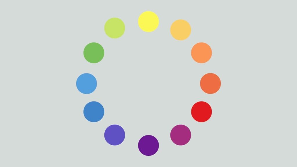
Color Meanings You Should Know
If you’re ever tasked with choosing colors for a creative project, think about who your audience is and how you want the final product to make them feel. Chances are, there’s a color out there that will help you achieve just that.
Let’s take a look at some of the most popular colors and what they’re commonly associated with.
Red
Red is a powerful color that’s often associated with strong emotions like love, passion and anger. It’s exciting and motivating and can even have a physiological effect on people, raising blood pressure and heart rate. It can signify power, strength and importance. It’s also the universal color for danger. In design, red is a great accent color as it demands attention, but it can be overwhelming when used liberally.
Orange
Orange is a fun, vibrant color that typically symbolizes youth, creativity, enthusiasm, adventure and trying new things. It’s warm and energetic like red, but isn’t dangerous. Because of its juvenile nature, it’s often used in products and designs geared at children. In the Western world, orange used in marketing can signify that the product is affordable. In some Middle Eastern countries, on the other hand, it signifies loss and mourning.
Yellow
Yellow is associated with hope, happiness, cheerfulness and optimism. It’s a warm, bright and energizing color. It’s said to stimulate the logical side of the brain, facilitating learning and decision-making. Like red and orange, it’s attention-grabbing, so it often signifies caution. In many African cultures, yellow symbolizes wealth, because of its resemblance to gold. In France, it’s associated with jealousy and deception.
Green
Green has a calming, balancing and revitalizing effect on our emotions. Lighter shades tend to signify growth, new beginnings, health and freshness. Brands that use these colors typically want to be seen as healthy, safe and environmentally friendly. Darker shades of green are often associated with money, wealth, stability and abundance. Green often symbolizes luck, though it can also signify jealousy and inexperience. In design, it’s most commonly used as an accent color to indicate a forward movement or positive attributes.
Blue
Blue is another relaxing, calming, cool color. It can signify peace, trust, loyalty and honesty. Darker shades are associated with a strong, reliable and responsible character. Overall, blue is conservative, predictable and dependable, making it a popular choice among tech companies, financial institutions and airlines. In many cultures around the world, blue has religious associations and is considered pure and divine.
Purple
Historically, the purple pigment was very expensive to produce and was unaffordable to most people, so the color is often associated with wealth, luxury and royalty. It can also symbolize creativity, imagination, mystery, magic and spirituality. Purple is uplifting and inspiring. Lighter shades are associated with romance, fun and whimsy. In Thailand, Brazil and a few other nations, purple is associated with death and grieving.
Pink
Pink is a friendly, playful color. It is commonly associated with love, romance, kindness, compassion, sympathy, sweetness and tenderness. Darker, more saturated shades of pink are perfect for making a bold statement or adding a bit of fun to a design. In Latin America, pink is a popular color for architecture and can be found on many building exteriors.
Brown
Brown is a neutral color most commonly associated with nature, earth, stone and wood. It suggests warmth and familiarity and can be characterized as dependable, comforting and honest. Brown makes us feel grounded and reminds us of our ties to nature. Brands that use brown in their visual identity and marketing are often seen as wholesome, well-established, natural, sustainable, vintage or hand-crafted.
Gray
While other colors are associated with emotions, gray tends to be unemotional and conservative. It’s a great choice in professional and corporate settings, as it feels formal, sophisticated and modern. In design, it creates a stable, reliable backdrop and is perfect for supporting other colors.
Black
Black is one of the most powerful, yet versatile colors, and carries a wide range of meanings. In design, it’s a popular choice for text and accents because of the high contrast it provides. When used as the main color, it can signify power, elegance, exclusivity and luxury. It feels formal, sophisticated, chic and modern. It exudes confidence and authority and can sometimes even feel a little intimidating. However, in most cultures, black also symbolizes death, grief, evil and the unknown. Because it has strong positive and negative associations, context and the choice of supporting colors are particularly important.
White
White symbolizes purity, cleanliness, innocence, virtue, goodness and perfection. It’s a popular choice for modern, sophisticated brands with a minimalistic aesthetic. White can sometimes feel sterile and reminiscent of a hospital setting, but it can also feel chic and luxurious, especially when paired with metallic accents. It makes a great backdrop for other colors and, like black, can take on different characteristics, depending on what it’s paired with. In many Eastern cultures, white is associated with death, mourning and sadness.
Create Meaningful Art Through Color
Color psychology is a powerful tool for artists, illustrators, graphic designers, interior designers, photographers and anyone working with visual media. Use it in your own work to stand out, connect with your audience and maximize your impact.
Color psychology and color theory go hand in hand, so if you haven’t already, be sure to familiarize yourself with the basic principles of color theory, too. Using the two together will help you master the art and science of color, so you can use it intentionally and effectively every time.
Try Skillshare for free! Sign up for a 7 day free trial today!
Get Started- Unlimited access to every class
- Supportive online creative community
- Learn offline with Skillshare's app
Join Skillshare
Join today for unlimited access to thousands of classes and more.
Try Skillshare For Free


