

Responsive Web Design: Definition and Mechanics Explained
Learn about the definition, origins, and mechanics of responsive web design, and discover why responsive design is crucial for user satisfaction.


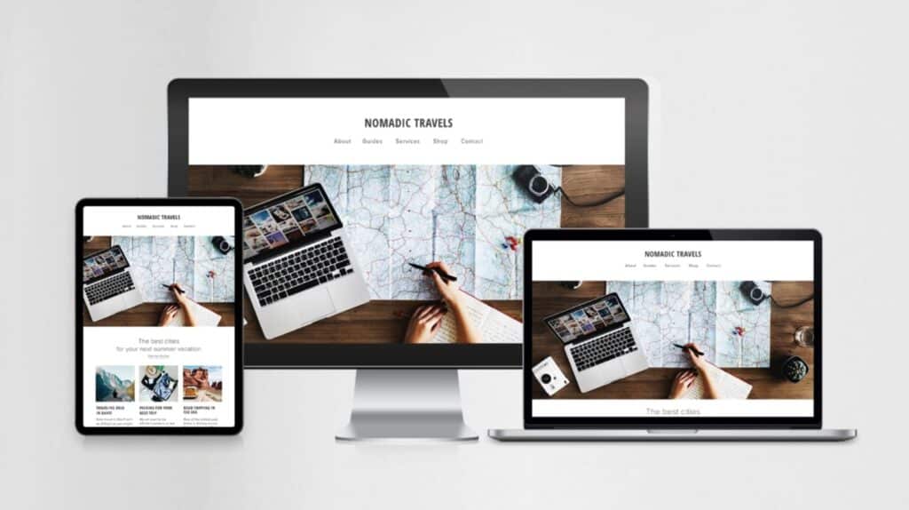
People access the internet through a myriad of devices ranging from smartphones and tablets to laptops and desktops, which makes it essential for web designers to ensure a seamless browsing experience across all platforms. That's where responsive web design comes into play.
With responsive design, websites can adapt to the screen size and orientation of the device being used, which provides a truly top-tier experience for users. If that sounds like something you'd like to implement in your website, learn about the definition, origins, mechanics and importance of responsive web design.
The Origins of Responsive Design

In a nutshell, responsive design is an approach to web design that is guided by the idea that a website should adapt (i.e., respond) to the size and shape of a user's device. In other words, if you're browsing a website on your smartphone, it shouldn't look like a miniaturized version of its desktop counterpart. Instead, it should adapt to your device by changing its layout, text size and other elements.
The idea of responsive design first emerged as a solution to the challenge posed by the proliferation of devices with varying screen sizes and resolutions. Its roots can be traced back to the early 2000s, which is the time when web developers began to experiment with fluid layouts and flexible images to create websites that could adapt to different screen sizes.
But it wasn't until 2010 that web designer Ethan Marcotte officially coined the term "responsive web design" in an article published on A List Apart. Since then, responsive design has become the standard approach for building websites, with web development being the most involved field in its implementation.
The Importance of Responsive Design

Responsive design is not just a trend; it's an absolute necessity in the modern digital landscape. With over 50% of internet traffic coming from mobile devices, knowing how to make a responsive website has never been more crucial.
After all, a responsive website ensures that users can access content and navigate a site seamlessly, regardless of whether they're using a tablet, laptop, smartphone or different type of device entirely. As a result, responsive design also improves user experience and satisfaction, which are both key factors in retaining visitors and converting them into customers.
The Mechanics of Responsive Design
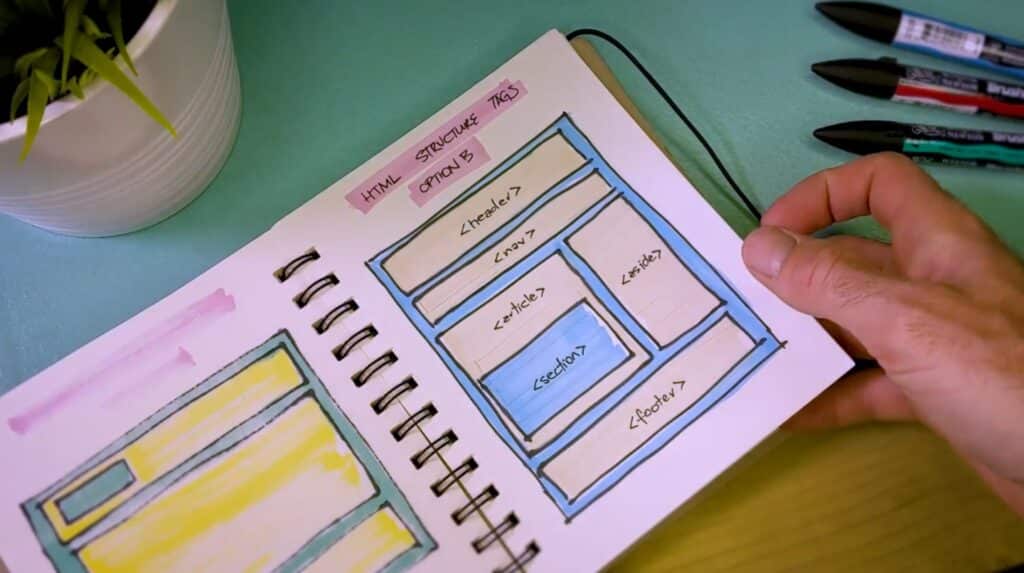
At its core, responsive design employs a combination of flexible grids, fluid layouts and media queries to adapt the presentation of a website to its viewing environment.
Here's how it works:
Flexible Grids
Responsive design employs flexible grids to create layouts that can automatically adjust to various screen sizes and their proportions. Rather than relying on fixed units like pixels, developers instead use relative units like percentages to define grid layouts. This approach allows content to fluidly adapt to different screen dimensions, ensuring a consistent and visually appealing layout across devices.
Fluid Layouts
In addition to flexible grids, responsive design also often incorporates fluid images to prevent distortion or cropping on different screen sizes. By setting images to resize proportionally using CSS properties, developers ensure that images scale appropriately to fit the available space without sacrificing quality or clarity. This ensures that images remain visually impactful regardless of the device used to view them.
Media Queries
Media queries are CSS techniques that enable developers to apply different styles based on specific conditions, such as screen width, resolution, or device orientation. By using media queries, developers can create responsive designs that adapt dynamically to changes in the viewing environment. For example, developers can define different styles for desktop, tablet, and mobile devices, ensuring a responsive user experience (UX) across a wide range of devices.
CSS Breakpoints
These are specific points in the layout where the design responds to changes in screen size by adjusting its appearance and behavior. By strategically defining CSS breakpoints based on common device widths, developers can create designs that gracefully adapt to different screen sizes without sacrificing readability or usability.
5 Responsive Web Design Examples
Looking for inspiration? Here are five fantastic examples of websites that showcase effective responsive design:
- Google: Google's homepage adjusts seamlessly to different screen sizes, ensuring a consistent user experience across devices. This is a great example of how even a simple site page can use responsive design to improve users’ experiences.
- Amazon: Amazon's website dynamically rearranges content and navigation elements to accommodate various screen sizes, making it easy for users to browse and shop. Notice how product images change their size according to the user’s screen, which keeps the shopping experience smooth and visual.
- The New York Times: This news website employs responsive design to deliver a readable and visually appealing experience on devices of all sizes. With a site like this, it’s critical for even long blocks of text to be easily legible, which The New York Times achieves.
- Apple: With its sleek layout that effortlessly adapts to different screen sizes and resolutions, Apple's website is a prime example of responsive design. Note that even the site’s beautiful scrolling animations work perfectly on just about any device.
- GitHub: Offers a user-friendly experience on both desktop and mobile, with navigation elements that adapt for touch screens.
Get Started with Responsive Web Design
If you want to create websites that provide users with a seamless experience on any device, responsive web design is nothing short of essential. By understanding its origins, importance and mechanics, as well as seeing examples of its effective implementation, you can take the first step toward creating responsive websites that wow users and drive results.
Ready to take the next step? You'll find it on Skillshare, where our online responsive design classes are waiting to help you become a better UX designer and create unforgettable websites.
Carrie Buchholz
Carrie Buchholz is a freelance writer who lives in Northern Colorado with her husband and dog.
Try Skillshare for free! Sign up for a 7 day free trial today!
Get Started- Unlimited access to every class
- Supportive online creative community
- Learn offline with Skillshare's app


