Updated: May, 2 2024
The 10 Best Adobe Fonts to Stand Out
Boost your typography skills with our guide to the best Adobe Fonts. Discover top-rated options and essential tips for choosing the right typography.


Are you looking to elevate your design projects with captivating typography, but hesitant to spend your hard-earned cash on multiple individual font licenses? Adobe Fonts (formerly known as Adobe Typekit) might be the solution you’re looking for. Here, we’ll explore the world of Adobe Fonts and unveil some of the best options available to help your designs stand out.
The best part? You don’t need to break the bank with an additional Adobe Fonts subscription—anyone with an Adobe Creative Cloud subscription can access and use Adobe Fonts for no extra cost.
The Importance of Fonts and Typography in Design
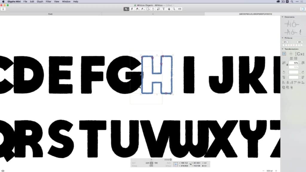
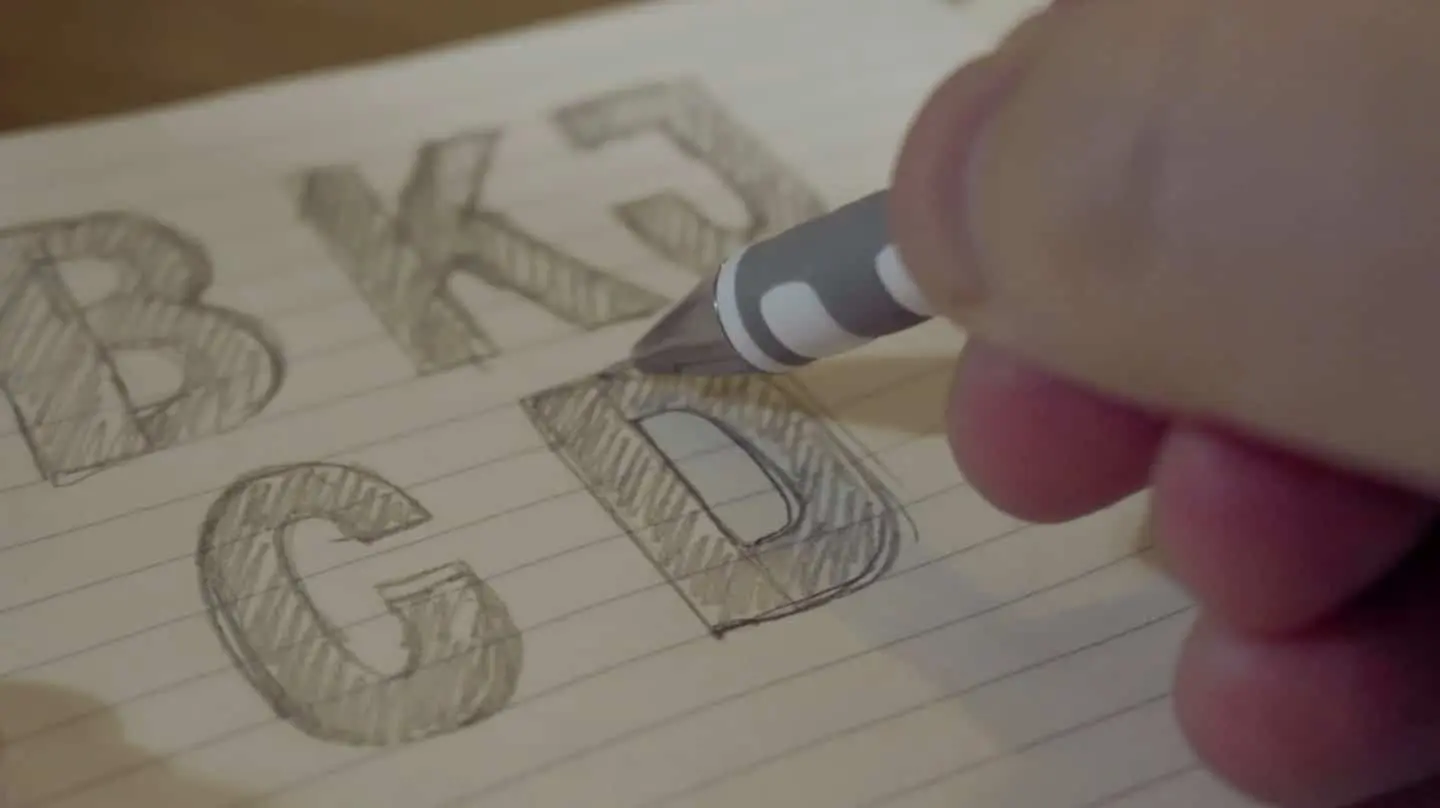
Typography is about much more than just picking a pretty font or copying what’s trendy; it’s a cornerstone of design that can make or break the effectiveness of your visuals. Fonts convey personality, mood and intent, and can determine the crucial first impression that viewers get from your message.
Whether it’s a website, a poster or a logo, the typography you choose will play a vital role in conveying your (or your brand’s) identity. And while elaborate, highly stylized fonts may seem eye-catching at first, prioritizing legibility ensures that your message is easily understood across different mediums and audiences.
But where can you even get new fonts to play around with? Once you’ve exhausted the built-in fonts included with your preferred design software, there are several resources you can use to expand your font library. If your designs are only for personal use, for instance, you may be satisfied with the free options found on sites like DaFont, which you can then add to Photoshop or another design program.
If you plan to use your designs for commercial purposes, though, you’ll have to take licensing fees into consideration. Online font marketplaces like Fontspring offer a variety of options at a wide range of price points, many of which cost less than $20, but that can add up quickly if you want to experiment with various fonts instead of committing to a single one.
So if you’re looking for a solution that allows you to work with a wide variety of fonts that are licensed for both commercial and personal use, but don’t want to purchase each font license individually, a subscription-based service like Adobe Fonts could be perfect for you.
Discover the Top-Rated Adobe Fonts
If you’ve decided Adobe Fonts is the right typeface resource for you, you may be overwhelmed by its staggering number of options.
To narrow things down, consider starting with one of these 10 standout Adobe Fonts:
- Neue Haas Grotesk: A clean and versatile Helvetica-style sans-serif font perfect for modern designs.
- Lato: With its friendly appearance and extensive font weights, Lato is ideal for both print and digital projects.
- Merriweather: A serif font that seamlessly blends classic and contemporary aesthetics; think of it as a more modern version of Times New Roman.
- Open Sans: Known for its legibility and wide range of styles, Open Sans is a foolproof choice for any design that demands simplicity and readability.
- Viktor Script: If you’re looking for a font that appears handwritten but is also clear and easy to read, look no further than Viktor Script.
- Source Sans: Developed by Adobe, this font combines simplicity with versatility, making it suitable for just about any design project.
- Tenso: Clear, robust and sporting the perfect amount of style, Tenso is ideal for when you want to maintain legibility while still standing out from the crowd.
- Operetta: With its classic 19th-century-inspired elegance, Operetta is ideal for luxury brands and editorial layouts.
- Abolition: Bold, eye-catching and decidedly unique, Abolition is well-suited for headlines, websites and branding materials.
Tips for Choosing the Right Typography
Selecting the perfect typography can be daunting, but with the right tips you can navigate the process with ease. Here are some guidelines you can use to choose a stellar font quickly and confidently:
- Consider your audience and message: Before selecting a font, it’s essential to understand who your target audience is as well as the message you want to convey. That’s because different demographics respond to typography in unique ways, so consider factors such as age, culture and preferences. For instance, a playful and whimsical font might appeal more to children than adults, while an elegant calligraphy font might be perfect for event invitations.
- Prioritize readability over style: As we mentioned above, while stylish fonts can add flair to your design, readability should always take precedence. Opt for fonts that are easy to read, especially for longer text passages. Factors like letter spacing, line height, and font weight play crucial roles in ensuring legibility across different mediums. Also remember to test your chosen fonts in various sizes and formats to ensure they maintain readability under different conditions.
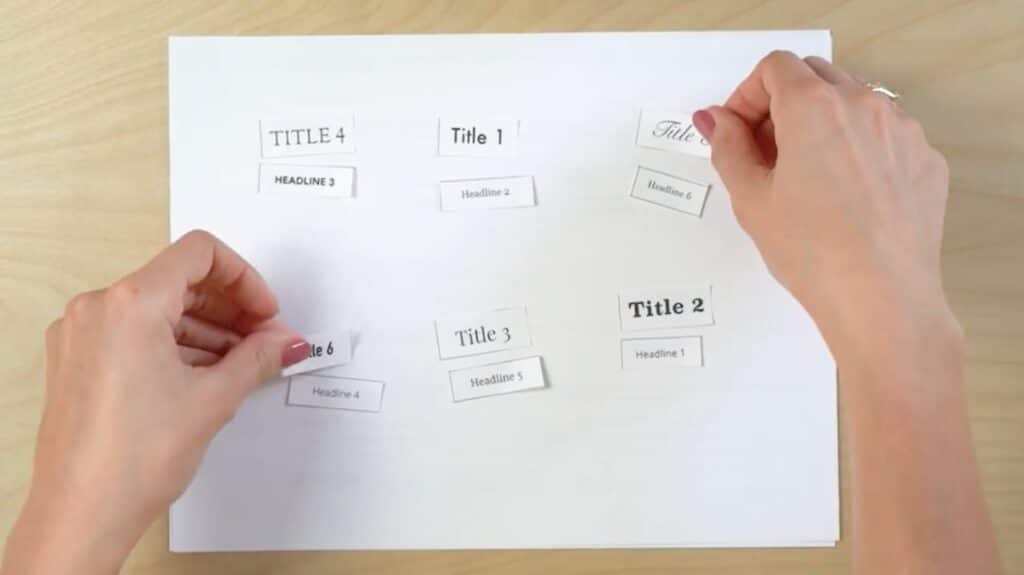
- Experiment with font pairings: Thoughtfully pairing Adobe fonts can create visual interest and hierarchy in your designs. Try experimenting with contrasting styles, such as pairing a serif font with a sans-serif font, to create dynamic combinations. Or to maintain consistency, consider using one font for headlines and another similar font for body text to establish a clear hierarchy and guide the viewer’s attention. Strive to strike a balance between cohesion and contrast to achieve a harmonious and visually appealing layout.
- Take medium and context into account: Both the medium and context of your design play significant roles in font selection. For instance, you’ll need to consider how your typography will appear across various platforms, such as print, web and mobile devices. Fonts that work well on a website may not translate as effectively in print, so adapt your choices accordingly. Additionally, think about the context in which your design will be viewed and adjust your typography to suit the tone and purpose of the project.
- Test and iterate: Last but not least, don’t be afraid to experiment, test and iterate on your typography choices. Design is a process of refinement, and finding the perfect font for your design may require some trial and error.
Master the Art of Typography With Adobe Fonts
Typography is a powerful tool in design, and Adobe Fonts offers a plethora of options to elevate your projects with just a Creative Cloud subscription. By understanding the importance of typography, discovering cool Adobe fonts and following the handy tips shared here, you can master the art of typography and create visually stunning designs that truly stand out.
Ready to expand your expertise in the Adobe Suite? Skillshare’s selection of online Adobe classes make it easy to do so whenever and wherever you want.
Try Skillshare for free! Sign up for a 7 day free trial today!
Get Started- Unlimited access to every class
- Supportive online creative community
- Learn offline with Skillshare's app
Join Skillshare
Join today for unlimited access to thousands of classes and more.
Try Skillshare For Free


