The Psychology of Fonts: How Typefaces Shape Emotion & Influence Design
Fonts speak louder than words. And they might be influencing you more than you think.
Typography is everywhere you look, subtly influencing how you interpret the messages around you. Whether you're scrolling through social media, reading a website or walking past a sign, the fonts you see may be shaping your experience more than you realize. The right font can evoke trust, excitement, nostalgia, and more, whether you know it or not. So if you understand the psychology behind fonts, you can make better design choices and communicate more effectively in your own projects.
Ahead, we’ll explore the fascinating connection between typography and psychology. You'll learn how fonts affect perception, see how brands use typography as a marketing tool and discover the emotional responses different fonts can trigger. Whether you’re a designer, hobbyist, marketer or creative professional, you’ll come away with the knowledge you need to choose the perfect font for every occasion.
What Exactly Is a Font, Anyway?

At its most basic level, a font is a set of characters—letters, numbers, and symbols—that share a consistent design. It’s how language visually takes shape on the page or screen. But if you’ve ever heard someone use the term typeface instead of font, you might wonder: are typefaces and fonts the same thing? The answer is… sort of.
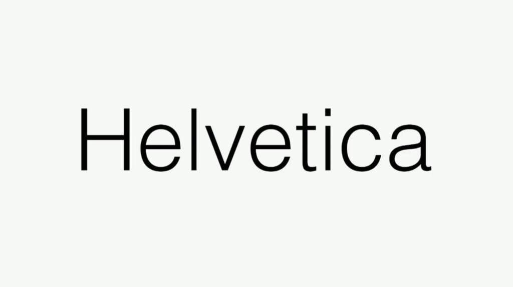
Technically speaking, a typeface is the design of the letterforms—a broader, overarching concept—while a font is a specific manifestation of that design. Think of it like this: if a typeface is a family, then fonts are the individual members. For example, Helvetica is a typeface, but Helvetica Bold 12pt or Helvetica Light Italic 16pt are distinct fonts. But these days, most people outside of design circles will use the words "font" and "typeface" interchangeably, and that’s more than OK for casual conversation.
The Evolution of Fonts
The concept of typefaces and fonts stretches all the way back to the invention of the printing press in the mid-1400s. Early printers like Johannes Gutenberg, the printing press' inventor, used meticulously carved metal blocks for each letter, with different sets—or fonts—for varying sizes and styles.
The earliest typefaces were designed to emulate the look of handwritten manuscripts, but by the 1470s, the French printer Nicolas Jenson had created the first Roman typeface to save space and increase efficiency. (Fun fact: Jenson's typeface still lives on today—it serves as the basis for the modern types Centaur and Adobe Jenson.)
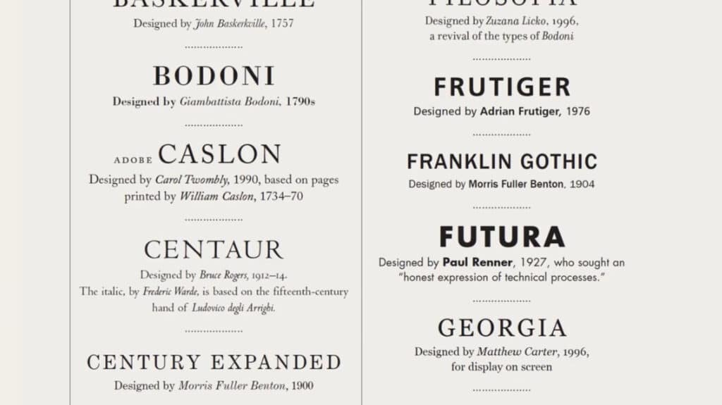
As printing technology continued to advance over the centuries, more and more typefaces emerged, many of them reflecting cultural shifts and artistic trends. By the 19th century, the Industrial Revolution was in full swing, and type design was thriving more than ever. Type foundries (companies that designed and sold typefaces) began to offer a variety of styles, from classic serifs like Baskerville to bold, solid typefaces like Clarendon.
And then the digital revolution came along, and everything changed. With the rise of personal computers in the 1980s and 1990s, fonts became accessible to the masses. Suddenly, anyone with a computer could choose from an ever-expanding library of digital fonts, no printing press required.
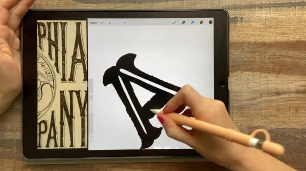
Today, in the era of portable digital devices and widespread internet culture, fonts are still incredibly accessible. What's more, just about anyone can create a custom font with nothing more than an iPad and some user-friendly design software. And with internet access, you’ll have no problem learning about typographic principles like kerning, leading and tracking.
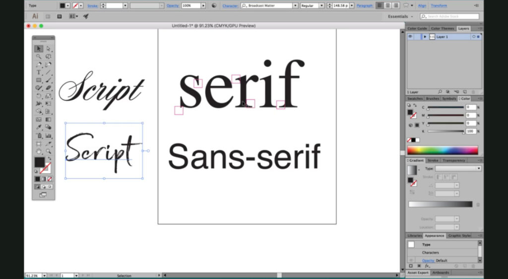
The bottom line is that fonts are no longer just tools to achieve better readability or save space; they’re also a form of personal expression and branding. The choice between a playful script and a minimalist sans-serif can influence how people perceive your message, and with thousands of fonts no more than a few clicks away, your options are practically limitless.
Why Fonts Affect Psychology

Fonts have a powerful psychological impact, even if we aren't consciously aware of it. Just as a person's tone of voice can change the way we interpret their spoken words, the art of typography directly influences how we interpret written messages. As such, the style of a font can create a knee-jerk emotional response and can shape how we subconsciously feel about what we’re reading before we even process the actual words.
How We Subconsciously Process Fonts
When we read, we aren’t just absorbing the meaning of the words—we’re also responding to how the words look. Our brains are constantly making snap judgments about the style of the text, even if we’re unaware of it. Because of that, certain fonts can carry associations and emotional cues that influence our perception almost instantly.
For example, a modern, sans-serif font like Helvetica can evoke a sense of clarity, efficiency and professionalism. Meanwhile, a decorative or hand-lettered typeface might feel playful, creative or informal. This subconscious processing happens in milliseconds, and it can set the tone for how we engage with a message.
To understand how quickly a font can influence your perception of a message, imagine seeing a sign with a font that contradicts its message. For instance, if you saw a sign that had the words "Warning: Risk of electric shock" printed in Comic Sans, you'd probably do a double take, and you might even take the sign less seriously than you would if it was printed in a more serious-looking font. That's how quickly and deeply a font can influence your first impression of a message.
The Importance of First Impressions
In the same way that we quickly form first impressions about people based on their appearance and mannerisms, we also make quick judgments about written communication based on typography. As you saw in the example above, fonts can affect how credible, approachable or serious a message seems: While a formal serif font like Garamond might convey tradition and authority, a playful, casual font like Comic Sans feels informal, sometimes to the point of being dismissed entirely.
Research has shown that certain fonts can even affect people’s ability to recall the information they just read. In a study published in the North American Journal of Psychology, researchers found that serif fonts resulted in a nine percent improvement in recall.
Ultimately, fonts aren’t just visual decoration—they’re a critical part of communication. Every font choice helps set the emotional context for the content it's being used for and actively shapes how the message is received, often before a single word is read.
Popular Fonts and Their Psychological Impact

Curious how the fonts you’re already familiar with may be impacting your perception? Here’s a quick breakdown of ten popular fonts and the psychological impact they have on readers:
- Helvetica: An exceptionally clean and modern font that's often associated with simplicity, professionalism and neutrality. It's frequently used by tech companies, government agencies and retail brands that aim to create a minimalist look. It was originally created in 1957 by the Swiss designers Max Miedinger and Eduard Hoffmann.
- Times New Roman: A classic and traditional font that conveys reliability, authority and seriousness. It's commonly used in formal documents and newspapers. It was first created in 1929 when the British newspaper The Times of London hired typographer Stanley Morison to create a new and more modern typeface for the publication to use.
- Garamond: An elegant and timeless typeface that suggests sophistication, intellect and history. It's often used in printed media, newspapers and scientific journals, and is named after the 16th-century French engraver Claude Garamond.
- Futura: Geometric and forward-thinking, Futura feels innovative, bold and, well, futuristic. It's been used by many high-end brands, from Louis Vuitton to Nike. It was first released in 1927 after being created by the German designer Paul Renner.
- Comic Sans: This whimsical font was inspired by comic book lettering and creates a friendly, informal vibe. It's often used in child-focused designs or informal settings and was first designed by Vincent Connare for Microsoft in the 1990s.
- Baskerville: A trustworthy and refined font that's known for its strong contrast and crisp serifs. As such, it’s often used to convey authority and elegance. It was first designed in the 1750s by the British businessman John Baskerville and has been revived several times since.
- Arial: This neutral and versatile font is similar to Helvetica. Thanks to its readability and straightforward style, it's often used in corporate settings and digital publications. It was created by the British typeface designers Robin Nicholas and Patricia Saunders.
- Courier: Monospaced and utilitarian, this font instantly evokes a retro feel and is often associated with simplicity and nostalgia. It was first created by American designer Howard "Bud" Kettler in the 1950s as a typewriter font.
- Didot: With its tall, elegant characters, this font is stylish and precise. It's often seen in fashion branding and suggests luxury, sophistication and polish. It's named after the French Didot family, who created the typefaces that inspired it in the late 18th and early 19th centuries.
- Pacifico: This relaxed and playful script-style font feels friendly, informal and creative. It's often used for lifestyle or handmade product branding and was first created in 2011 by Vernon Adams, a British designer who was inspired by 1950s American surf culture when drawing the typeface.
Patterns in Font Psychology
Looking at the fonts in that list, you may notice some clear patterns in how typography influences perception. As we mentioned earlier, sans-serif fonts like Futura and Arial often convey modernity, clarity and straightforwardness. Their clean lines and lack of decorative flourishes make them feel fresh, progressive and efficient, which is perfect for tech companies, startups or brands that want to project innovation.
On the other hand, serif fonts like Times New Roman, Garamond and Baskerville are rooted in tradition and history. They’re often associated with stability, trust and sophistication, which makes them a go-to choice for institutions, luxury brands and any publication that wants to feel timeless and authoritative.
Finally, script fonts and handwritten styles like Pacifico are typically perceived as being more personal and expressive. They’re often used to create a sense of warmth, creativity or nostalgia, which can give brands a more human, approachable feel. That's also why they're a popular choice for wedding and event invitations.
By understanding these patterns, creatives like you can strategically choose fonts that match the tone and personality of their message.
Font Psychology as a Marketing Tool

In the world of marketing, every detail matters, and that includes fonts. So for brands and creatives alike, typography isn’t just a design choice—it’s also a tool for influencing how an audience feels and responds. And when used effectively, font psychology can help businesses stand out and connect with their target audience on a deeper level.
How Brands Use Font Psychology
Successful brands carefully choose fonts to reflect their values, evoke the right emotions and communicate their intended message at a glance. The right font can instantly convey what a brand stands for—whether it’s modern and innovative, stylish and elegant, approachable and friendly or classic and reliable.
Here’s how major brands use font psychology to their advantage:
- Coca-Cola: The iconic Coca-Cola logo uses a flowing, vintage-style font that feels nostalgic and friendly. This typeface choice taps into emotions associated with tradition and happiness, which reinforces the brand’s long history and connection to good times.
- Apple: Apple’s custom minimalist, sans-serif font reflects the brand’s focus on simplicity, innovation and sleek design. The clean, modern typography is consistent with the company’s emphasis on cutting-edge technology and refinement.
- Disney: The whimsical, handwritten style of Disney’s logo evokes a sense of magic and imagination. It immediately signals that the brand is all about whimsy and wonder, which appeals to children and adults alike.
- The New York Times: The New York Times logo uses a traditional, Gothic-style typeface that harkens back to the early years of the printing press and conveys authority, history and seriousness. It was likely chosen to reflect the newspaper’s long-standing reputation and lengthy history.
Using Fonts Strategically in Marketing
For brands and creatives, the best font is the one that aligns with the tone and message they want to convey. For instance, a luxury brand might use an elegant serif font to communicate sophistication and exclusivity, while a tech startup may opt for a clean, sans-serif font to project innovation and modernity. In the same vein, a children’s toy company might use a playful, rounded typeface to create a sense of fun and approachability.
Font psychology isn't just important for logos, either—it’s crucial across all brand touchpoints, including websites, advertisements, social media posts, product packaging and more. The key is consistency and harmony: A well-chosen font can reinforce brand identity and build trust, but inconsistent or mismatched typography can confuse the audience and weaken the message.
By understanding the psychology behind typefaces, you can create stronger, more memorable connections with your audience and ensure that your visual communication is as intentional and effective as the words themselves.
Explore Typography with Skillshare!
Browse More Typography ClassesCustomizing Type with Draplin: Creating Wordmarks That Work
Build a Better Font: An In-Depth Guide To Creating Fonts
Hand Lettering Practice: 3 Easy Steps to Explore New Typography Styles
Graphic Design for Good: Design a Personal Manifesto
How to Choose the Right Font for Your Project

Choosing the perfect font can feel overwhelming, especially when there are thousands of options at your fingertips. But with a little knowledge and direction, you can quickly narrow down your choices.
Whether you’re working on a presentation, a brand logo or a social media post, here are some practical tips to help you choose the perfect typeface for your project:
1. Know Your Purpose and Audience
Start by asking yourself: "What is the purpose of this project, and who is my audience?" Your answer can help guide your decision. For example:
- A business report needs a clean, professional font like Times New Roman or Arial.
- A kids’ birthday invitation might benefit from a playful font like Comic Neue or Pacifico.
- A fashion brand’s packaging might benefit from something chic and high-end, like Didot.
Remember, your font choice should match the tone and expectations of your audience, whether they're made up of business executives or children.
2. Consider Readability First
No matter how stylish a font looks, it needs to be readable in order to be effective. So while fonts with overly decorative flourishes or extreme weights (i.e., parts that are extremely thin or extremely bold) might initially be attention-grabbing, they'll lose readers quickly if they’re difficult to read. Plus, it’s important to consider typographic accessibility and inclusivity if you want to reach every member of your audience.
Pro tip: If your chosen typeface is too thin to read easily, you might be able to salvage it by choosing a bolder version of the same typeface.
3. Think About Emotional Impact
Fonts evoke emotions, so choose one that aligns with the message you’re trying to send. For instance, if you:
- Want to convey trust and tradition, go with a classic serif font like Garamond.
- Want your text to look modern and clean, try a sans-serif font like Helvetica or Futura.
- Want to express creativity and warmth, choose a handwritten script font like Pacifico.
4. Use Font Pairing Wisely
Many projects can benefit from using two complementary fonts—one for headlines and one for body text. The key is to create contrast without clashing. For instance, you may be able to use a serif font for your headline and a sans serif font for your body text, but it will likely look best if the two fonts have similarly shaped letters.
5. Check for Consistency
Consistency is crucial for maintaining a cohesive look. Once you’ve chosen a font (or font pair), stick with it throughout your project. Switching fonts too often can confuse your audience and make your design look unfinished.
6. Test in Context
A font might look great in a sample image, but always play it safe by testing it in the actual context where you plan to use it. If it’s for a website, for instance, preview how it looks on different screen sizes. And for print projects, check how it appears on physical paper. You might find that what works digitally doesn’t translate well to print, and vice versa.
7. When In Doubt, Keep It Simple
In many cases, less truly is more. You don’t always need a fancy or elaborate font to make an impact, and you may find that a clean, timeless typeface can communicate your message more effectively than something overly complex or trendy. After all, there's a reason why widely used fonts like Centaur and Baskerville have remained more or less unchanged for hundreds of years.
8. Trust Your Intuition (But Get a Second Opinion)
If a typeface feels like it’s the right one for your project, it probably is! But at the same time, it’s always a good idea to get feedback from others, and that's especially true if your project is intended for a wider audience.
Master Typography With Skillshare
Practically since the invention of the printing press in the 15th century, typography has played a powerful role in how we perceive and respond to messages. So by learning about and mastering typography, you can change your communication for the better, whether you’re designing for clients or your own personal projects.
If you’re eager to expand your skills, Skillshare's online type design and typography classes offer a convenient way to learn from skilled experts. From the typography basics to detailed instructions for designing your own custom typeface, our classes can teach you just about anything you want to know.
Related Reading
Graphic Design with Skillshare – Start Your Free 7-Day Trial Now!
Start Your Free Trial Today!- Unlimited access to all classes
- Graphic design classes for all levels
- Learn offline with Skillshare's app


